Mozilla is working on a refresh of the user interface of its Firefox web browser under the codename Proton. As it stands, Proton will land in desktop versions of the web browser in May 2021 when Firefox 89 gets released.
Work is ongoing and many things are not final at this stage in development. We previewed the modernized tabs interface and the new main menu of Firefox already. While not final, it is clear that Mozilla is not just changing the color scheme or making light interface modifications.
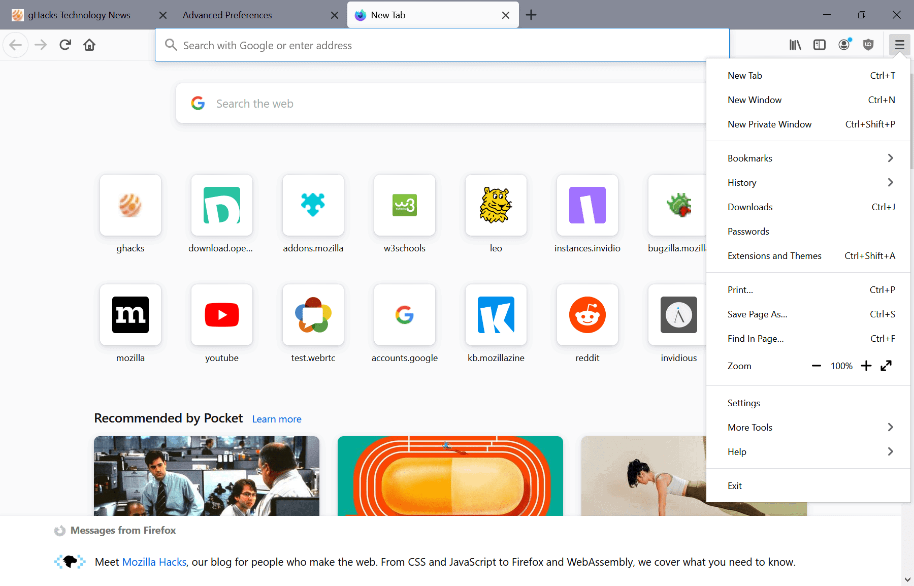
If you take a look at the main menu and compare it to the current one, you will notice quite a few changes. Many of which are designed to make Firefox leaner and look less convoluted.

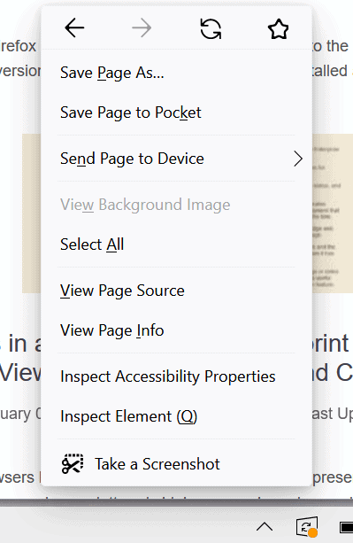
The new design throws out most of the icons in the menu that are displayed currently in all versions of Firefox for the desktop, but that is not the only change. You may notice that some menu items are missing: there is no "sign-in to Firefox" button at the top anymore, the link to the Protections Dashboard is gone, as are Send to Device, Open File and Save Page in Pocket, and the Edit row of options as well as the customize link may not be displayed anymore either in the main menu or context menu. Web Developer options are moved under the More Tools menu.
Some menu options are not gone entirely, but they appear only if certain conditions apply according to Sören Hentzschel, e.g. if a user is signed-in to Pocket, the option to save the page there is shown. Similarly, the Edit options are displayed if text is selected on a site, and send to device is active if Sync is activated.
Mozilla changed the order of elements, and added a "new tab" option to the menu. One of the main ideas behind the changes is to improve the usability; some options are scarcely used in the menu, mainly because they are also accessible elsewhere. Others, like the constant reminder to sign-in to Firefox irritate users who don't want to do that.
The change may be confusing at first, as users may wonder if Mozilla removed the options entirely.
The new context menu, which supports black and light modes, comes in a new look as well. Not all Firefox users will get the new menu. On Windows, it is limited to Windows 10. Mac OS X users will get a native context menu with support for the operating system's dark mode.

Some of the menu items that are still shown right now will be removed before the final release or only displayed if conditions are met.
Mozilla's optimizations don't end there. The organization plans to remove some elements from the main Firefox toolbar. The Home button, for example, will be removed for Firefox users who are using the default Firefox startpage and have not used the button. It will still be possible to add the button manually again, and everyone else will still have it displayed in the toolbar. Firefox users who modify the startpage will have the button placed in the toolbar automatically.
Similarly, sidebar and library buttons will be removed if they have not been used by the user. The removed options are displayed in the first level of the main menu now; previously, they were listed under library in the main menu.
Mozilla plans to remove the three dots menu in the address bar of the browser. Most of the options are available elsewhere already, some will get a dedicated icon instead that users may use once the changes land.
Closing Words
Redesigns are often problematic, especially when it comes to software that is used by hundreds of millions of users. There will certainly be some users who won't like some of the changes. Generally speaking, Firefox will become leaner and less convoluted once the changes land in Firefox Stable.
Ideally, users would get options to customize the menus to their liking. Vivaldi introduced support for editing menus recently, and Firefox supported this as well in the past through the use of browser extensions such as Custom Menu, Menu Filter 2, or Menu Editor. All of these are no longer compatible with recent versions of the browser because of the changes made to the extensions system.
Now You: Which menu items do you consider essential?
Thank you for being a Ghacks reader. The post Firefox 89's user interface will be leaner and less convoluted appeared first on gHacks Technology News.
0 Commentaires