Microsoft's OneDrive has turned 15. The Redmond company is marking the occasion by introducing a new design called OneDrive Home.

The cloud storage service debuted in August 2007, under the name Windows Live Folders, before it was renamed as SkyDrive. Microsoft was forced to change the name of the service after a legal dispute with a media network, and OneDrive became the official moniker in 2014.
OneDrive Home
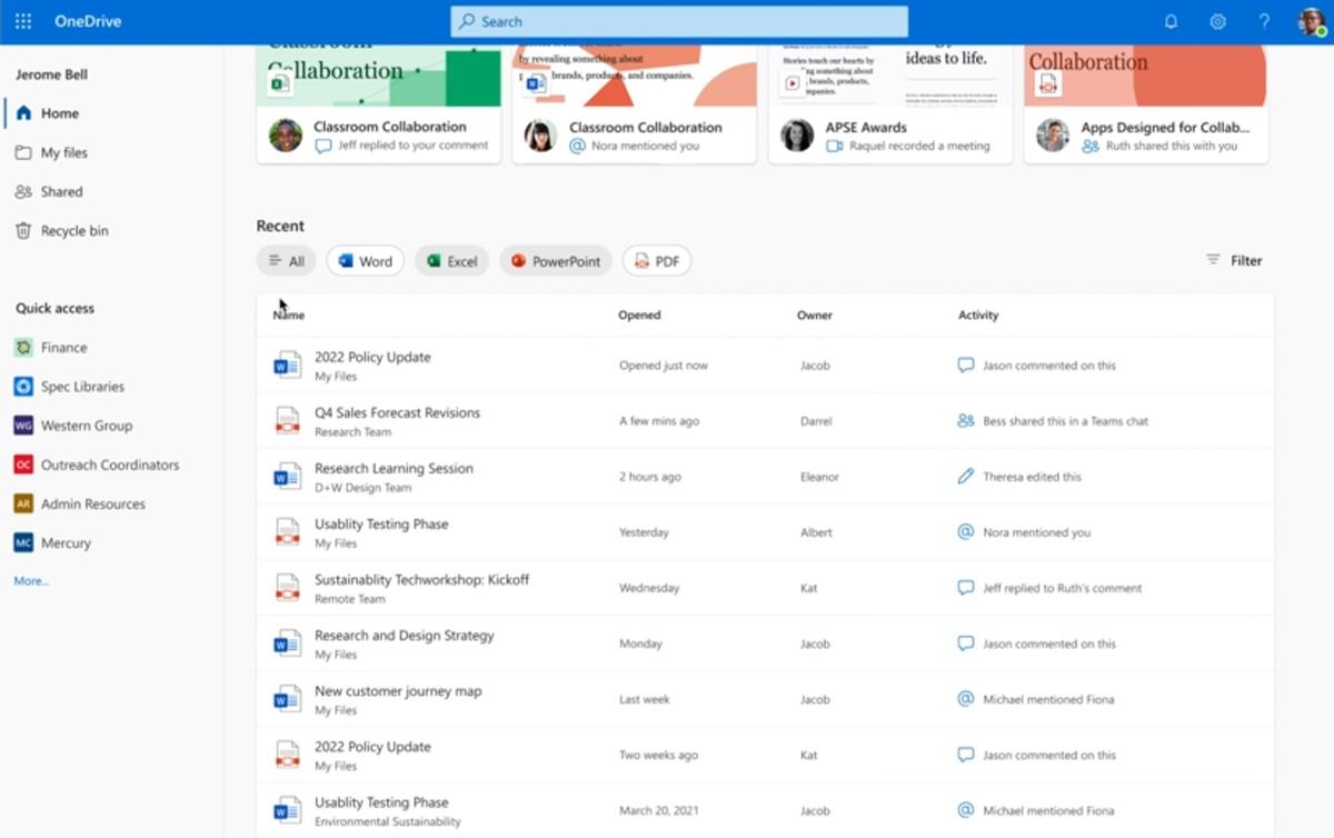
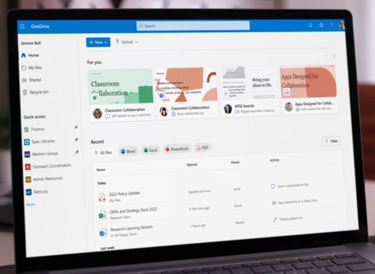
Microsoft has given OneDrive's web interface an overhaul. The Recent View page, is now called OneDrive Home. The old version of the page listed the document's name, when it was last opened, modified, the location (folder), and the document's size.

The new style has a content feed that lists relevant files, this includes a cover preview of your documents. This is followed by the Recent files section, which as the name suggests shows you the files that you accessed on the cloud in reverse chronological order. It's quite similar to Microsoft Office's Recent screen. You can view the date/time when a document was opened, the owner's name.
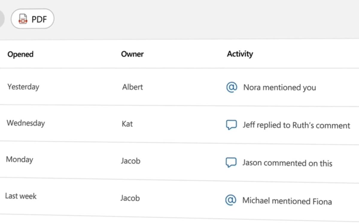
It also shows the recent activity such as edits, mentions and comments made by other authors (collaboration). This can be useful when you are resuming work, and want to catch up on the latest updates made by your colleagues. The Activity Column will also be available under the My Files tab.

Images via Microsoft
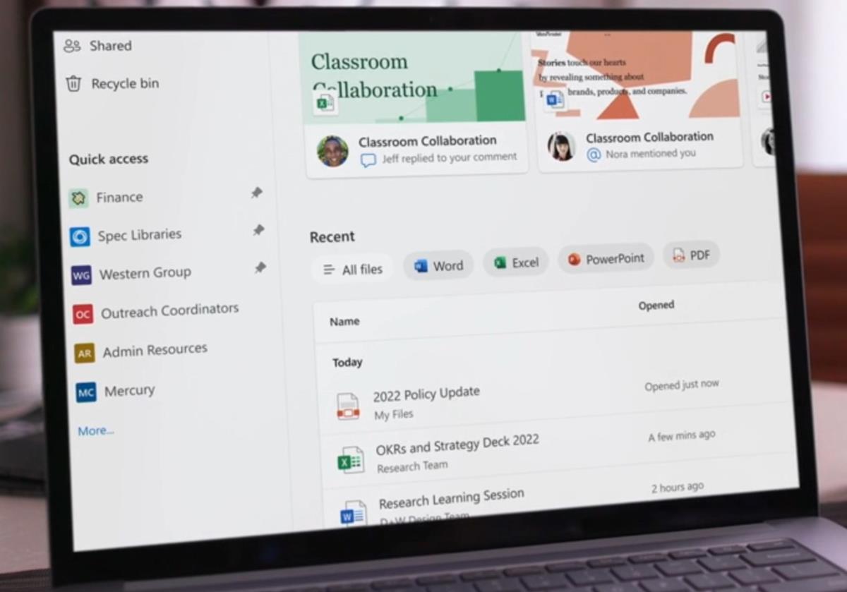
OneDrive Home has a toolbar at the top of the file list, that you can use to filter the files by type such as Word, Excel, PowerPoint or PDF. So, if you only want to view a DOCX, PPTX, XLSX or PDF, just hit the relevant button and OneDrive will hide the rest of the document types.
As part of the improved navigation experience, OneDrive is also getting a new side panel on the left, called the Quick Access bar. You can pin important files to it, and switch to them quickly. This appears to be similar to File Explorer's sidebar feature of the same name.

The new OneDrive Home interface is not available for users just yet. Microsoft says that the new landing experience will be rolled out to users in the coming months for work and school users. It seems strange The company wants users to have a familiar, consistent sharing experience across Office apps, Sharepoint, and Teams. So, we can expect these changes to be made available for Microsoft 365 with OneDrive.
OneDrive Photo Story
The OneDrive mobile app for Android and iOS has a new feature called Photo Story. It is in preview, and allows users to share a private, invitation-only feed of pictures, with their family and friends. Your contacts who have access to the photos will be able to comment, react and interact with the media. This appears to be similar to Instagram Stories.
OneDrive Photo Story is currently only available for users in Australia. It will be rolled out to users in the U.S., and other regions later this year.
The updated UI seems to be quite good, even though the focus is on collaboration.
Thank you for being a Ghacks reader. The post Microsoft OneDrive turns 15; gets a redesigned web interface called OneDrive Home appeared first on gHacks Technology News.


0 Commentaires