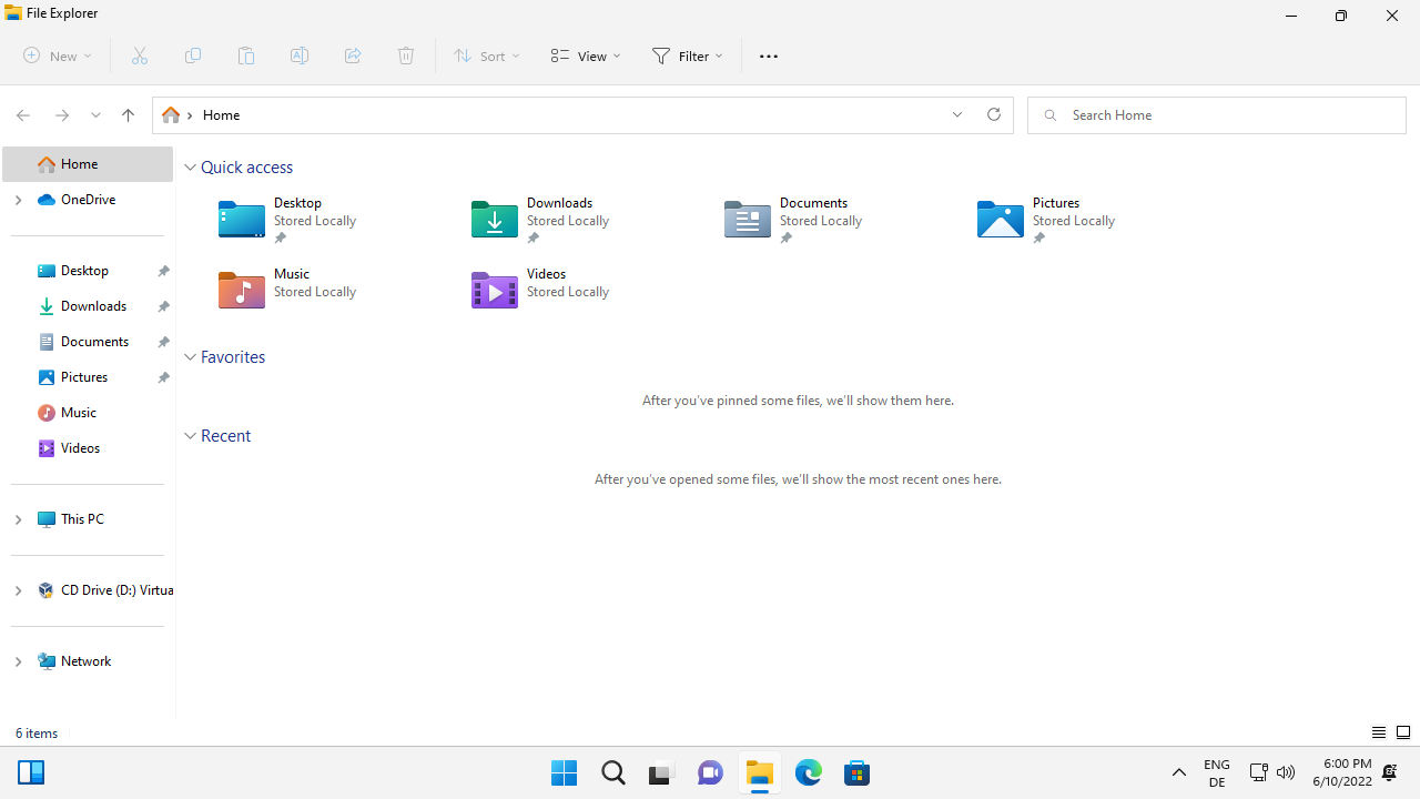
Windows 11 version 22H2 includes a new Explorer sidebar design and layout, that gives users more control over the links that are displayed in the File Explorer sidebar.

Microsoft released a new Windows 11 Insider build this week with several File Explorer improvements. Ashwin highlighted the tabbed File Explorer interface already, which many users have been waiting for.
Another File Explorer area that has been improved in the build is the file manager's sidebar. The sidebar lists links to various locations, including all connected and mapped partitions, optical drives, quick access links, OneDrive, network shares, and user folders.
The first thing that you may notice is that Microsoft added separators to better distinguish sidebar groups from one another. There is also a new Start section at the very top with a link to Microsoft's OneDrive file hosting and syncing service underneath it. OneDrive is displayed by default, even for local accounts and users who are not signed into the OneDrive app.
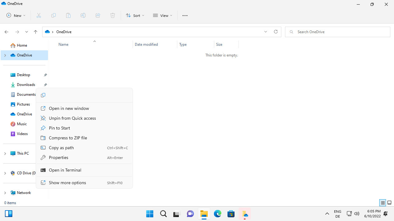
Uninstallation of the OneDrive app on the system removes the OneDrive entry in the File Explorer sidebar. The user folders are listed below Start in Quick Access, and when you expand This PC, you will notice that user folders are no longer listed in this group. This PC lists all mapped local drives, with optical drives displayed separately from hard drives.
Group titles, such as Quick Access, are no longer displayed. It is unclear if these will be added in later releases or are gone for good.

All user folders can be removed from the sidebar with a right-click on the item and the selection of "unpin from quick access".
The ability to display libraries is still present. Right-click on a blank location of the sidebar and select "show libraries" to add them. There you find options to hide This PC and Network, and to expand all folders in the sidebar or only the current folder.
Windows 11 adds a new Desktop root entry to the sidebar when you select "show all folders" in the right-click preferences. All sidebar folders and links can be collapsed and displayed with a click on the arrow icon of the desktop root entry.
Our colleagues over at the German tech site Deskmodder found out that the change will be included in Windows 11 version 22H2, which Microsoft plans to release later this year. There is still a slim chance that the change won't be included, but it seems unlikely at this point.
Closing Words
Microsoft modified the File Explorer sidebar significantly in the latest Windows 11 Insider build. The company removed the user folders from This PC and added group separators. Some users may miss group titles, as these are not displayed for all groups anymore.
Now You: do you use the File Explorer sidebar? What is your take on the changes?
Thank you for being a Ghacks reader. The post Windows 11: Microsoft improves File Explorer sidebar significantly appeared first on gHacks Technology News.
0 Commentaires