One of the things that went under the radar when Apple unveiled macOS Ventura last week, was the System Settings app. It replaces the legacy System Preferences.
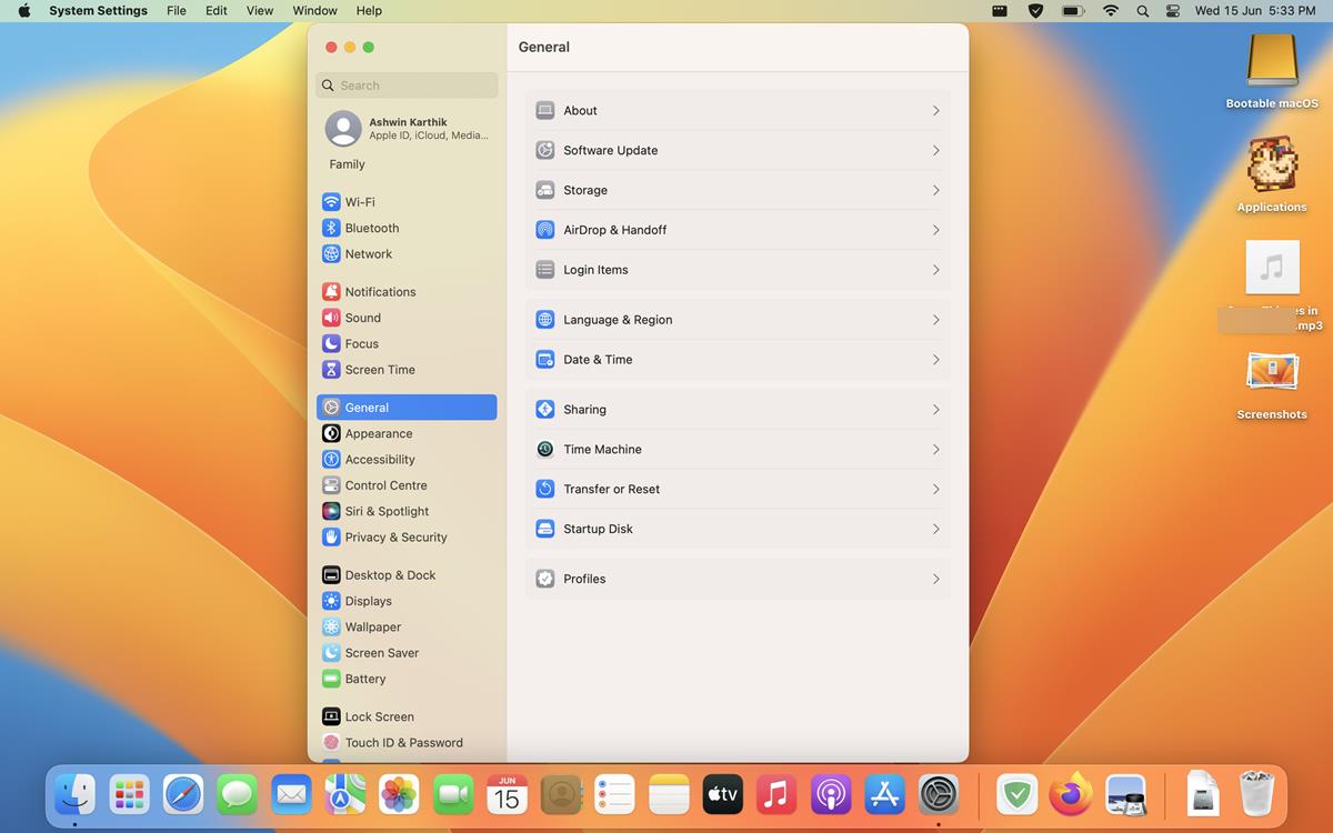
This is what the new design looks like, and here's a screenshot showing you the older version.
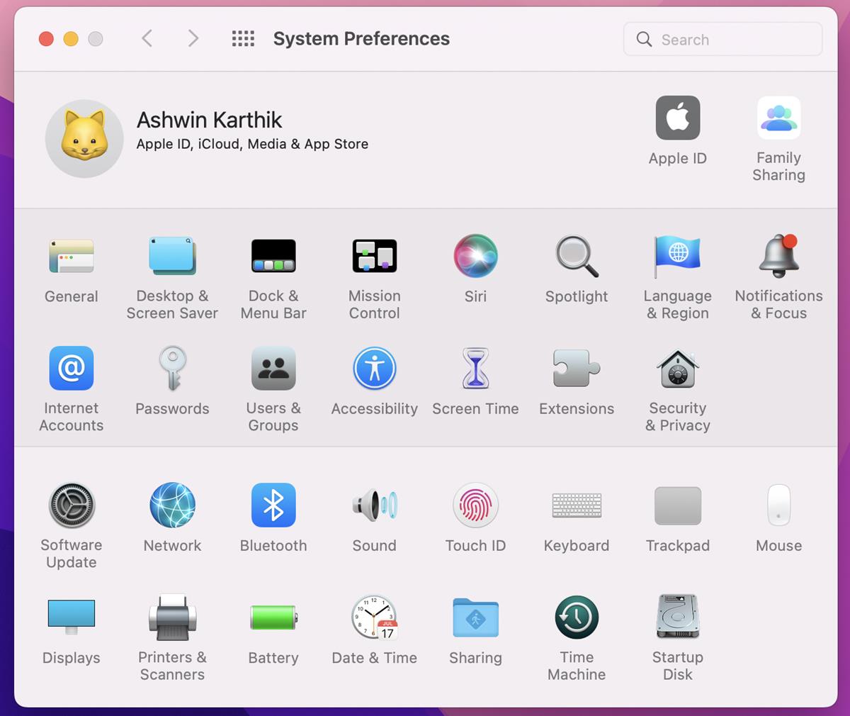
System Settings in macOS Ventura - An overview
The sidebar in the new version looks similar to the design of the Settings in iPadOS and iOS. The options on the side panel are grouped by functions, for example, all connectivity options are listed together. You could argue that it is like the Control Panel vs Settings app in Windows 11.
Major UI Changes - Toggles, Search, and Relocated options
Apple has done away with the checkboxes for the various settings in macOS Ventura, they are now replaced by toggles. This makes the app a bit more modern, and similar to iOS.
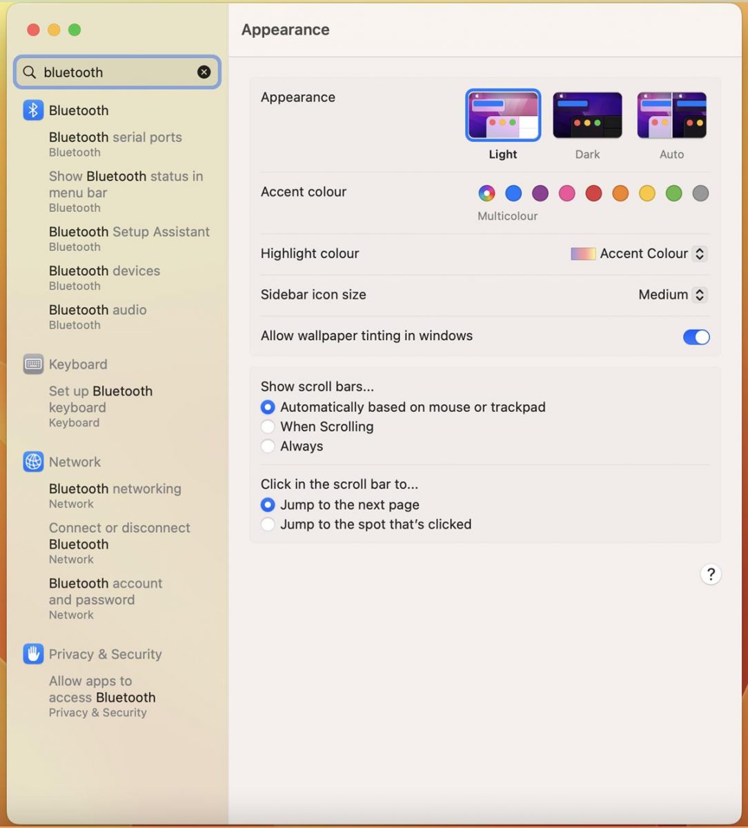
When you search for a setting in macOS Monterey or older versions, the System Preferences app highlights the corresponding section by shining a spotlight on the sections that match your query. The new System Settings in macOS Ventura does not display this spotlight, instead it displays the relevant results directly in the sidebar. This is very important because when you click on one of the results, the search results stay on the screen. So, if you clicked on a wrong section, you don't have to search for it again, just click on another option. Click the X button in the search bar to clear the results.
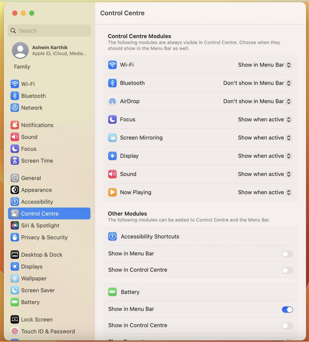
Many options have been relocated to new homes in the new Settings app. The Control Centre settings allows you to customize the menu bar icons, these options were previously available under Dock and Menu Bar, but you had to click on various sections (Wi-Fi, Siri, Focus, etc) to show/hide them. It's a lot more convenient to have all these toggles in one place, including icons for accessibility shortcuts.
That said, Apple has done the opposite for some options. Most of the menu bar, homescreen and dock options, are now located in the Desktop and Dock tab. The Software Update, Date and Time, Language and Region are listed under the General section. Siri and Spotlight now share a settings page.
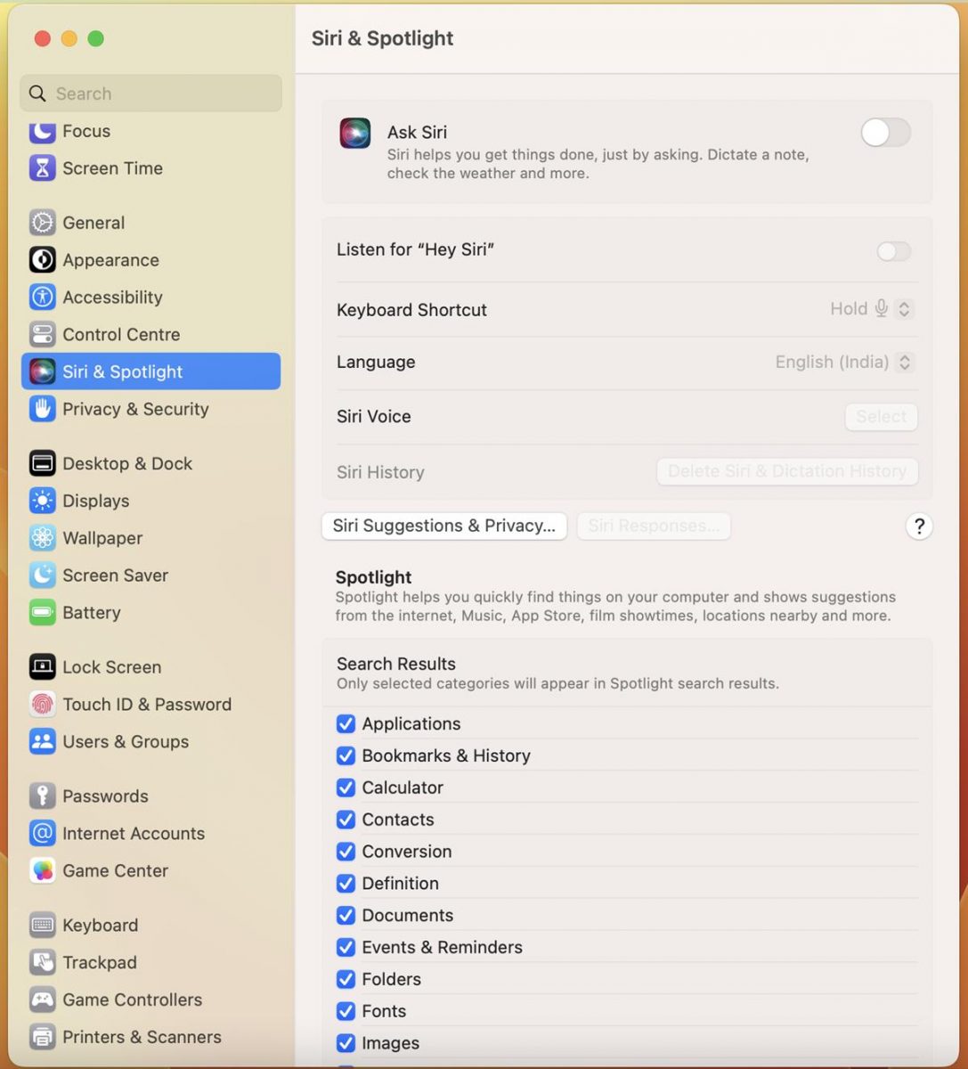
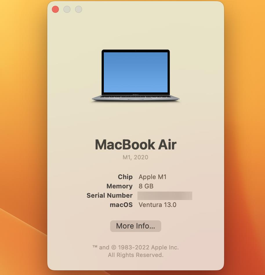
The "About this Mac" panel no longer has a shortcut for Software Update and the tabs for Display, Storage, Support have all been removed from the window. Clicking the "More Info" button takes you to the General > About section, which displays some information about your Mac.
Speaking of the General section, the options that were previously available under it have been moved to the Appearance tab.
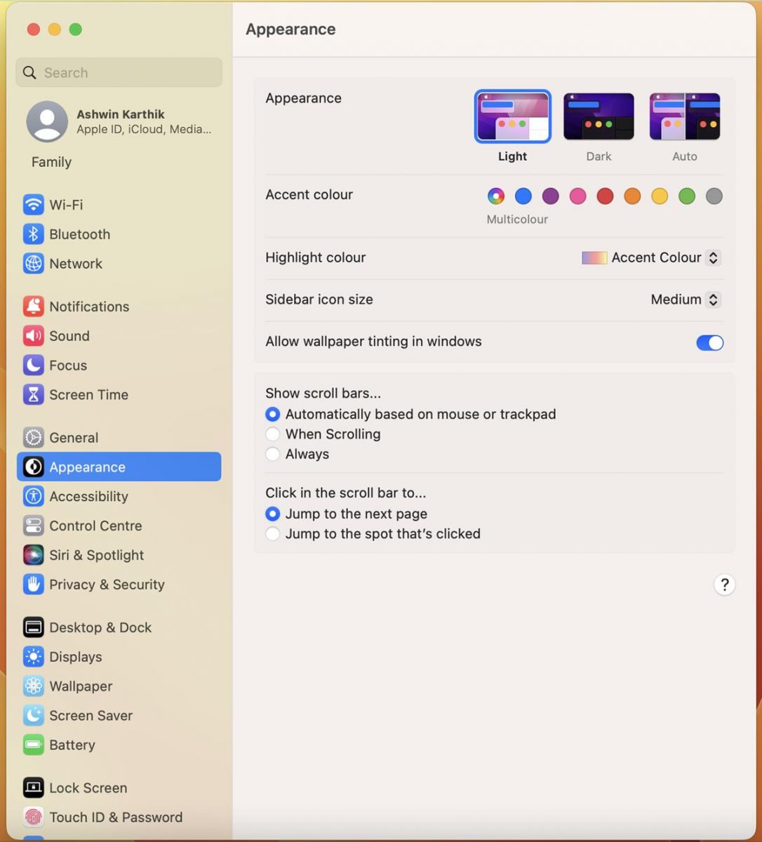
Some settings take fewer clicks, while others take more, the changes are a bit inconsistent.
No Trackpad gesture demos in the beta
The Trackpad gestures videos that appear under System Preferences are not available in the beta version macOS Ventura. During the WWDC Talk Show, Craig Federighi confirmed that new demo videos are being produced, and will be included in a future release.
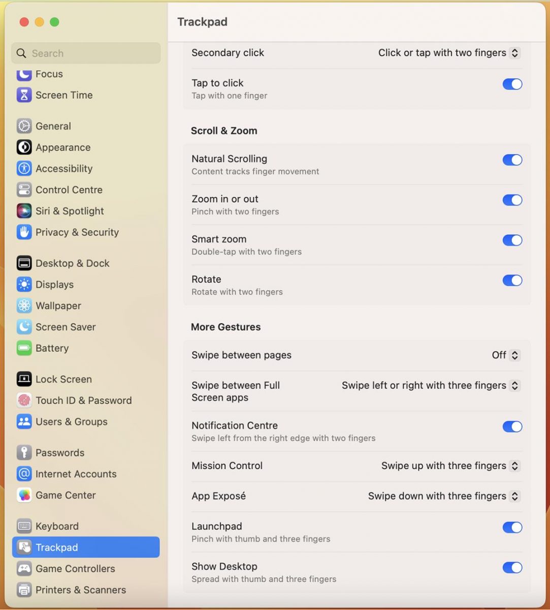
Federighi also explained that the transition from System Preferences to Settings had to happen to make it easier for users to access various options quickly. Instead of clicking a section to open it in a different screen and going back to modify something, you can simply scroll down the list and manage the options that you want to edit.
The Storage settings lets you view and manage what's taking up space on your Mac, and delete them easily. There is a new section that allows you to manage game controllers. You can view and edit your Game Center profile directly from the settings app.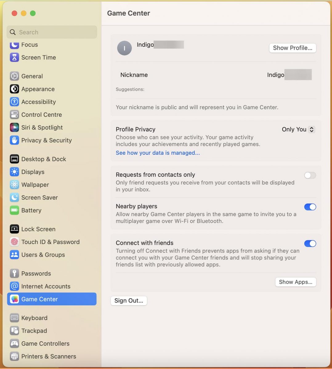
There is no real surprise here, the System Preferences app needed an overhaul, and Apple has done just that. As an iPad user, I like the new System Settings app in macOS Ventura, but fans of the older app may dislike it, and that's understandable. The new Settings are well organized for the most part, except for the General tab's options. Apple has crammed too many options under this section, which I feel would be easier to access from the sidebar.
It will take a while before you get used to the new Settings, and that's why I recommend using the Search function. Take a few moments to read about Stage Manager, the new Mail app, and Spotlight features in Ventura.
Do you like the new System Settings in macOS Ventura?
Thank you for being a Ghacks reader. The post We take a closer look at new System Settings in macOS Ventura appeared first on gHacks Technology News.
0 Commentaires