Earlier this year, Google revealed a new Gmail design. The email service is now rolling out the new interface for users as the default option.
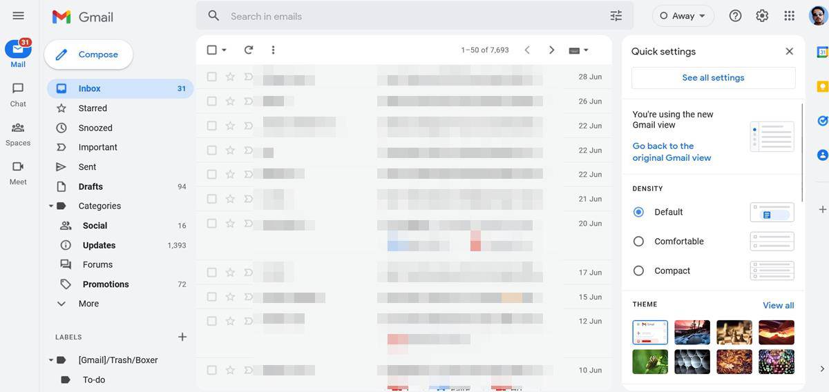
New Gmail design
The new Gmail design has a sidebar that allows you to switch between Mail, Chat, Spaces and Meet. When you switch to the new interface, you may notice that Gmail's side panel has disappeared. Don't worry, it's still there. Mouse over the Mail icon, and it will display the classic menu which has the shortcuts for the Inbox, Drafts, Sent, Bin, and all your labels.
It might be a little cumbersome to move the mouse over to the left every time you want to access one of the options. The solution for this is simple, just click on the hamburger button above the menu, to pin the sidebar permanently. Similarly, you can collapse the menu for a minimal experience whenever you want.
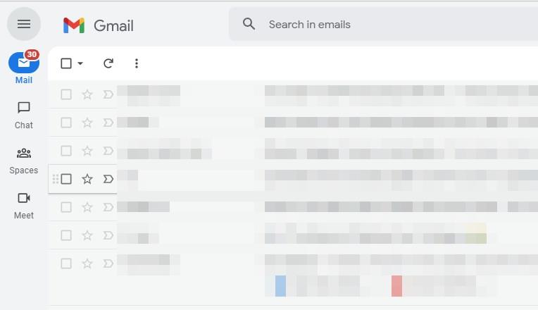
The new Gmail View displays the hover preview for other services regardless of whether the menu is collapsed or open. If you have Gmail open, and want to quickly access Chat, just mouse over it to view a list of your conversations, without leaving the Mail view. The icons on the sidebar support unread badges to indicate that something needs your attention. When a new message arrives, you will see a notification in the corresponding service. The accent color of some visual elements have been updated.
That is pretty much all that has changed in the Gmail experience. The rest of the interface is the same, including the side panel on the right edge of the screen, with shortcuts for Calendar, Keep, Tasks, Contacts, etc.
A support page on Google says that users will be able to choose the apps that are listed on the sidebar, by clicking on Settings > Apps in Gmail > Customize. This should allow users to remove Chat, Spaces and Meet from the side panel, but I don't see the option for this.
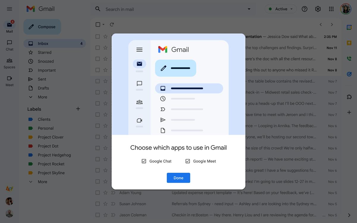
Image credit: Google
How to enable the new Gmail design manually
1. Access the Quick Settings panel from the top right corner of the page.
2. Click on the "Try out the new Gmail view" button.
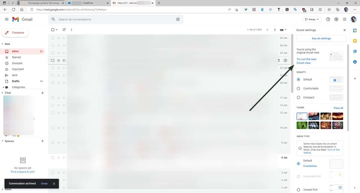
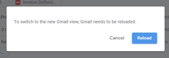
3. The website will prompt you to reload the page to switch to the new Gmail design. Click the reload button to refresh it.
The new Gmail view should be enabled for you.
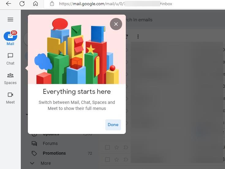
Note: The option to switch to the new Gmail design may not be available for all users just yet. It didn't appear for me in Firefox, but when I accessed it via a Chromium-based browser (Edge), it appeared. So, if you don't have the new view, you may want to try that, but YMMW.
The important thing here is that the new Gmail interface is an opt-out experience, i.e., it will be enabled by default. If you wish to restore the classic Gmail design, you can do so from the Settings menu.
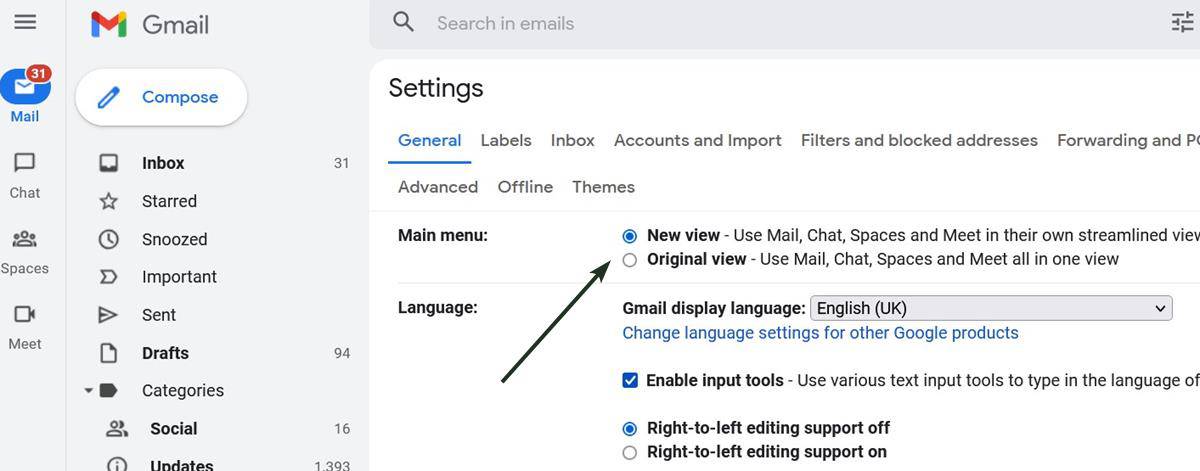
If you don't see that option in the menu, there is another way to get the old GUI back. Click on the cog wheel, and select "see all settings". The first set of options, under the General section, allow you to switch between the new and original views. Hit the save button at the bottom of the page to apply the changes. This option was originally meant to be removed by the end of Q2 2022, but since the new design is just beginning to roll out, we can expect it to stick around for a few more months, before Google pulls the plug on it.
Do you like the new Gmail design?
Thank you for being a Ghacks reader. The post Google begins rolling out the new Gmail design to users as the default option appeared first on gHacks Technology News.
0 Commentaires