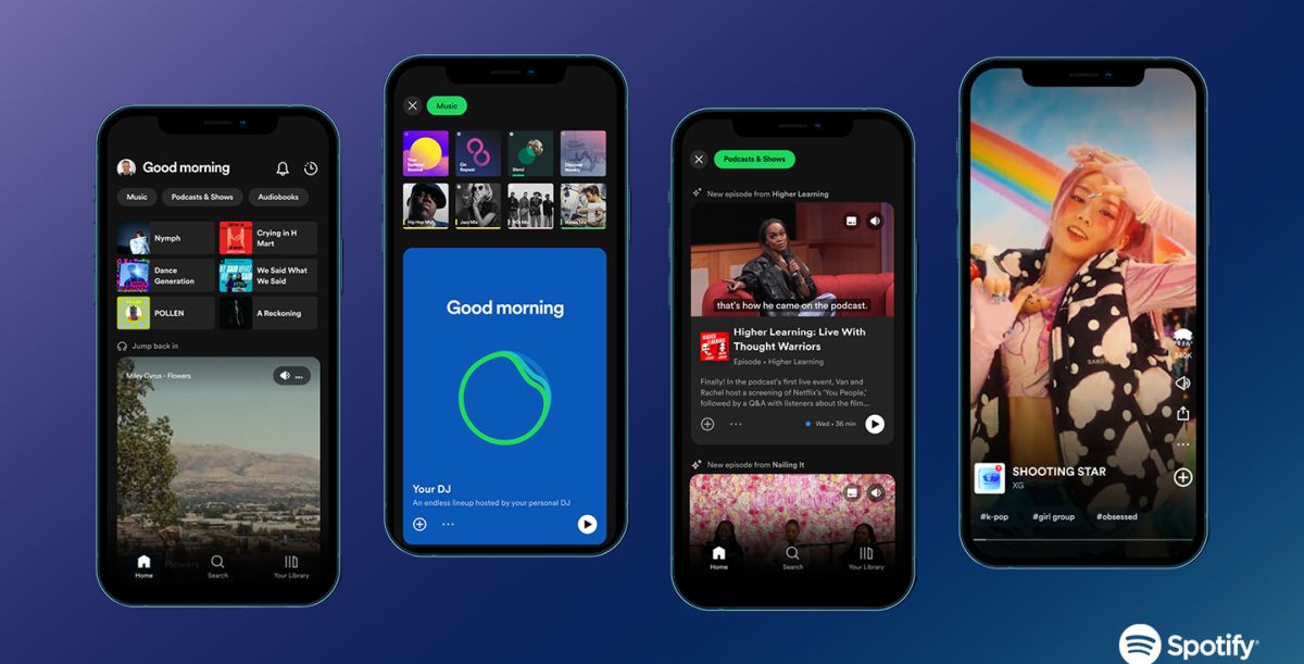
Spotify introduced its new design at the Stream On event, and it looks like the company is shifting toward a different path as it wants it to be more than just a music streaming platform.
The new interface looks more like other popular social media platforms like TikTok and Instagram. People spend hours and hours on these apps, and this act developed an unintentional habit of wanting to scroll vertically on all apps. Spotify decided to respect the current trend and bring vertical scrolling to the app with a better visual experience compared to the previous design.
Users will now see feeds of visual and audio previews of playlists, albums, podcast episodes, and audiobooks in a newly implemented feed of vertical video rather than a static carousel of playlists and recommendations. If you have the latest update, simply click on "Music" or "Podcasts and Programs" placed at the top of the homepage. You will be welcomed to the new feature, which will recommend many different playlists, albums, podcasts, etc.

"We've found that the next generation of listeners craves better ways to sample audio before fully diving in. So get ready for a more active experience with advanced recommendations, a spotlight on visual canvases, and a completely new and interactive design—all to make discovering new audio easier than ever before and help introduce users to their next favorite artist, podcast, or book. Together, these updates work to bring creators and fans closer than ever, and help each build lasting connections," says Spotify.
Another feature the company talked about is Smart Shuffle. "This new experience keeps listening sessions fresh with personalized recommendations that perfectly match the vibe of an original user-generated playlist. It breathes new life into carefully curated user-generated playlists, shuffling tracks and adding new, perfectly tailored suggestions," says the music streaming app.
Spotify doesn't want to be recognized as a "music app" but wants something bigger. The company invested in podcasts and audiobooks in the past few years and created a useful hub for artists and listeners. Even though the platform didn't benefit from it financially, it definitely set it apart from its competitors.
The new design also shows that it wants to get out of its classic line and look like other social media platforms like TikTok, Instagram, and YouTube. Maybe someday, we might see Spotify shape into a real social media platform like the others.
Spotify's wide range of innovations has more to offer, as the company recently introduced its new AI DJ tool. It is only offered in the US and Canada but will soon hit the global market. If you are located in North America, check out our guide on how to use it!
Thank you for being a Ghacks reader. The post Say hello to Spotify's new TikTok-inspired design appeared first on gHacks Technology News.

0 Commentaires