Microsoft began experimenting with the Windows 11 Search button on the Taskbar a few months ago. The feature, which was previous only rolled out to a limited number of users, is now available for all users.

Windows 11 Preview Build 25295 lets users change the Taskbar's Search style
Before we discuss the feature, I should mention that the new options are only available in Windows 11 Preview Build 25295 that has been released to participants in the Dev Channel of the Windows Insider Preview Program.
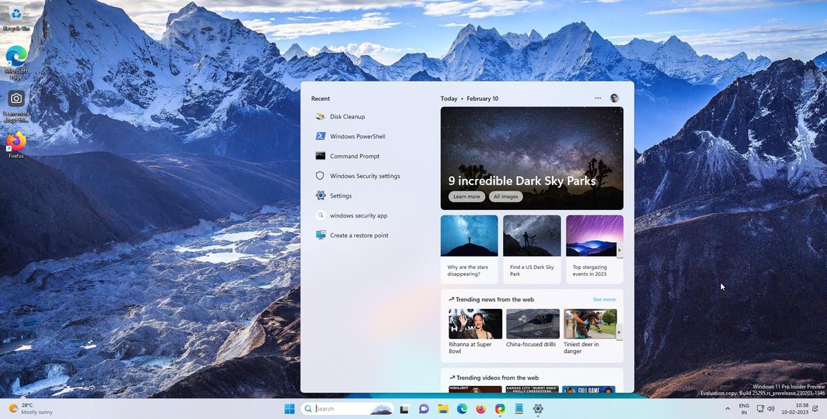
There are three appearances that you can choose from: Search box, Search icon and label, Search icon only. Each of these differ slightly in appearance and functionality. The default style that Windows 11 is set to use is the Search box, it has a large text box with an image near the right edge, a magnifying glass icon on the left edge with the word "Search" next to it. Clicking inside the box allows you to type your search query directly in it, but it also opens the Start Menu's Search section, that is useful because it displays the search results as you type. The search icon changes in color to a rainbow-esque gradient, when you click in the box.

The next option, Search icon, is similar to what you will find in the stable version of Windows 11. It has a smaller box with the label "Search" and an icon to its left. Unlike the box style, the icon does not let you type your query directly in the text field. However, it does switch the cursor's focus to the search field in the Start Menu. The animation for the Search icon style changes the background color of the box to blue, and the text/icon color to white.
![]()
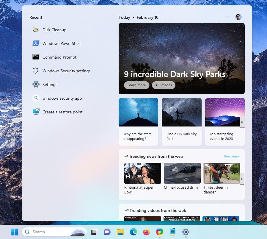
The last of the three options is the "Search icon only" style, and it discards the box and the label completely, leaving just the icon on the Taskbar. This is the minimal version of the 3 appearances that you may choose, but is essentially identical to the previous option in terms of how it works, i.e. it opens the Search section in the Start Menu. It shares the same search icon animation as the gradient effect in the Search box.
![]()
When Martin wrote about the big search field on the Taskbar, he called it an unnecessary addition. He makes a valid point. Not everyone may want to have an extra button on the Taskbar, let alone a gigantic search box, thankfully Microsoft has retained the option to remove Search altogether, with the Hide option.
How to change the Taskbar's Search style in Windows 11 Preview
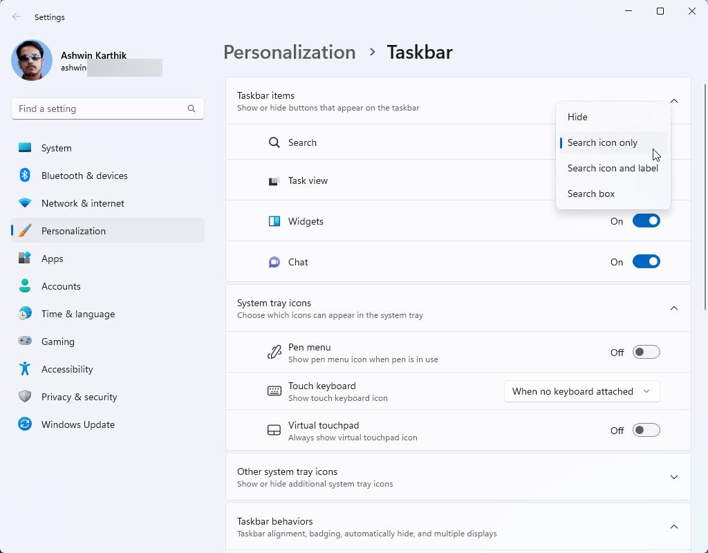
1. Right-click on the Taskbar, and select Taskbar Settings. It opens the Personalization > Taskbar page in the Settings app.
2. The Taskbar Items section at the top of the page has an option for Search.
3. Click on the drop-down menu next to it.
4. Select one of the following options: Search box, Search icon and label, Search icon only, Hide.

This will change the Search box's style on your Taskbar instantly. You can try each appearance to see which one looks best.
Note: The new styles are not exclusive to the Centered Taskbar, they can also be customized with the left-aligned Taskbar.
I think the Search app would be more useful if it didn't open the Start Menu and displayed all the recommended content. That's what I like about Everything Toolbar, its minimalist approach.
Have you tried the new Search styles on the Taskbar? Share your thoughts about it.
Thank you for being a Ghacks reader. The post Windows 11 Insider Preview Build 25295 allows users to change the Taskbar's Search style appeared first on gHacks Technology News.
0 Commentaires