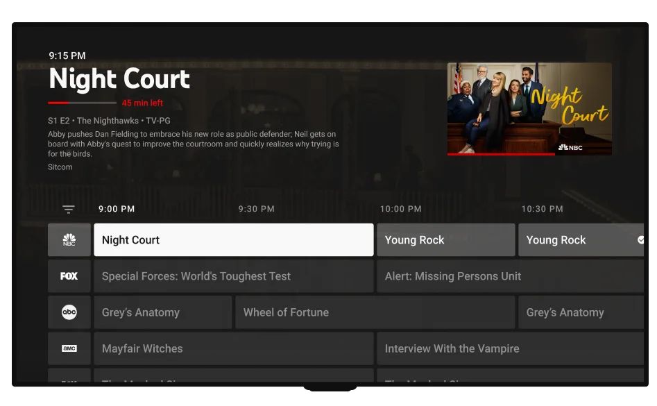
Google has released a new version of the YouTube TV app, to bring a new Live Guide experience for Apple TV devices. The update brings a redesigned interface for the streaming app.

Apple TV gets a redesigned YouTube TV Live Guide and Library
YouTube had revealed the new layout for its TV app about a month ago. The announcement made by Esther Ahn, the Head of Design for YouTube TV and Primetime Channels highlighted the changes implemented in the new experience, such as the importance of finding information about a show without scrolling too much. The company listened to feedback from users to find out areas that needed to be improved, that's the focus of the update, it revamps the Live Guide and Library sections in the app to help users find what they want in fewer steps.
CordCuttersNews reports that the update had rolled out to Apple TV users earlier, but Google had to pull the update due to some issues in the app. The new YouTube TV layout is now rolling out to users again, after the bugs were patched.
The new YouTube TV Live Guide has a compact layout compared to the old style. The grid view shows the titles and times of what's playing now, and also lists upcoming shows. The app displays more information about a highlighted show at the top of the screen as you scroll through the list, instead of appearing only when you click on a show. Another noticeable change is the addition of a clock in the top left corner of the screen.
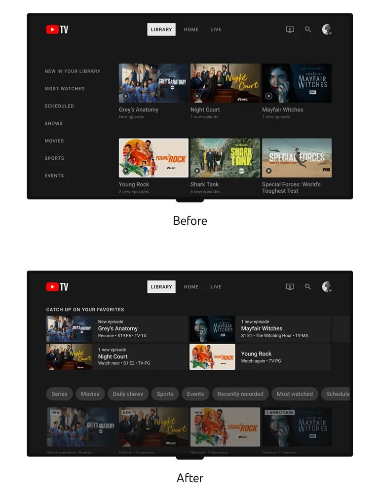
Moving to the YouTube TV's Library, the sidebar on the left has been removed, instead, it now displays a tile view with a section to "Catch up on your favorites", and another larger section featuring various categories that you may be interested in, for example, Series, Movies, Sports, Daily Shows, etc. You can see the redesigned UX in the screenshot below.

YouTube TV users were finding it difficult to find their recorded content (DVR media), this issue has also been addressed in the latest update. The new user experience for the Library tab has filters to quickly navigate to your recorded videos (DVR content), most watched media, etc.
The focus of the update seems to be on suggested shows, which is evident by the new curated recommendations section at the top of the Live Guide tab in the app. Google says it plans to tweak the discovery and browsing experience in the app with further improvements in the future, with minimal disruption to its users.
Both the Live Guide and the Library have shortcuts that you may use to add shows to your library. YouTube's blog indicates that it will soon introduce a Set Reminder option as well. The announcement also mentions that Google is working on more improvements for flexibility and interactivity during live playback, and wants to allow users to switch easily between different profiles.
The new YouTube TV Live Guide is rolling out slowly, you may have to wait a while to get the redesigned UI. Some users have complained that they were experienced crashes in the YouTube TV app, it goes to a black screen on Apple TV 4K devices. A YouTube community manager has confirmed that the TV app was not starting correctly on Apple TV devices, and that Google is working on fixing the issue.
Thank you for being a Ghacks reader. The post New YouTube TV interface is rolling out to Apple TV devices appeared first on gHacks Technology News.


0 Commentaires